don’t tear it down
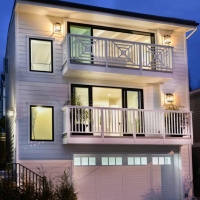
When the client, a developer, bought this wreck of a crash pad, she thought it would have to be razed. But about:space saw the potential to save the structure (and keep some valuable non-conforming set-backs and height) and completely rebuild the front facade into a fresh clean “of the moment” stunner.
walk-out
balconies
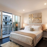
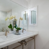
On both levels, balconies enlarge the space and extend it to the outdoors. Bathrooms are compact yet highly functional, end everything feels light and bright.
walls, be gone
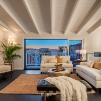
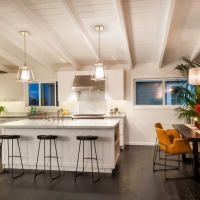
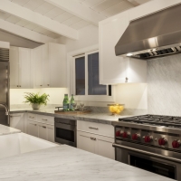
Floor plan alterations made infinitely better use of very limited space, and taking down walls created a wide open plan on the top living level, flooding every corner with light. White paint everywhere, and stylish staging by First Impression Design, helped potential buyers imagine their lives inside.

